Role
Sole designer
Progress
Ongoing
Duration
12 months
Team
Technical Program Manager (1)
Developers (2)
Executive Summary
The Consultant Workstation Dashboard redesign addressed critical efficiency bottlenecks for Scentsy's growing consultant base. As Lead UX Designer on this project, I transformed a fragmented workflow into a unified, data-driven command center designed to reduce task completion time by an estimated 35% while accommodating a projected 20% annual growth in consultant operations. The solution was approved unanimously by executive stakeholders and was preparing for beta release when my position was eliminated during company restructuring.
Business Challenge & Strategic Context
Scentsy's 200,000+ consultants were navigating between 5 disconnected systems to manage their daily operations, resulting in:
• Estimated 12-15 additional hours per month spent on administrative tasks
• Inconsistent data visibility creating revenue-impacting decision delays
• Significant onboarding friction for new consultants (averaging 3-5 weeks to operational proficiency)
• Increasing support tickets (~10% YoY growth) related to workflow confusion
As the UX designer assigned to this strategic initiative, I was tasked with unifying these critical business functions while ensuring the solution would scale with Scentsy's aggressive growth targets.
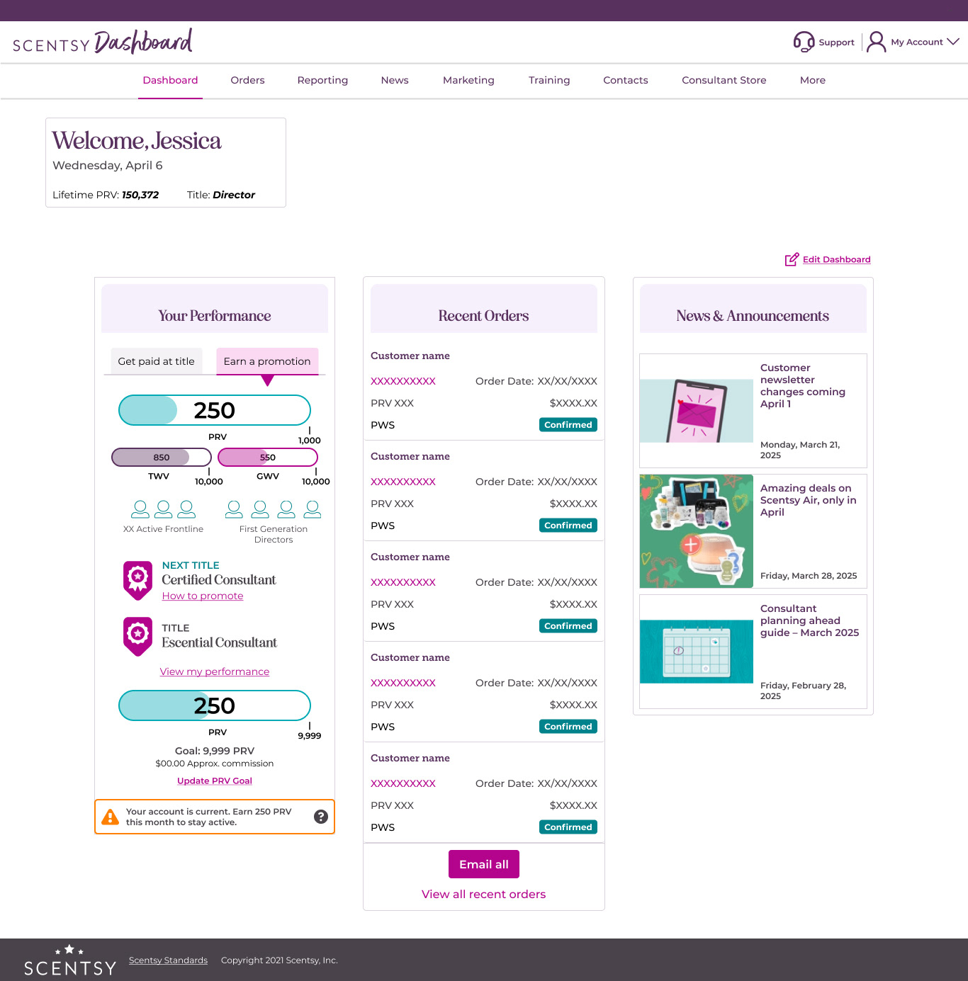
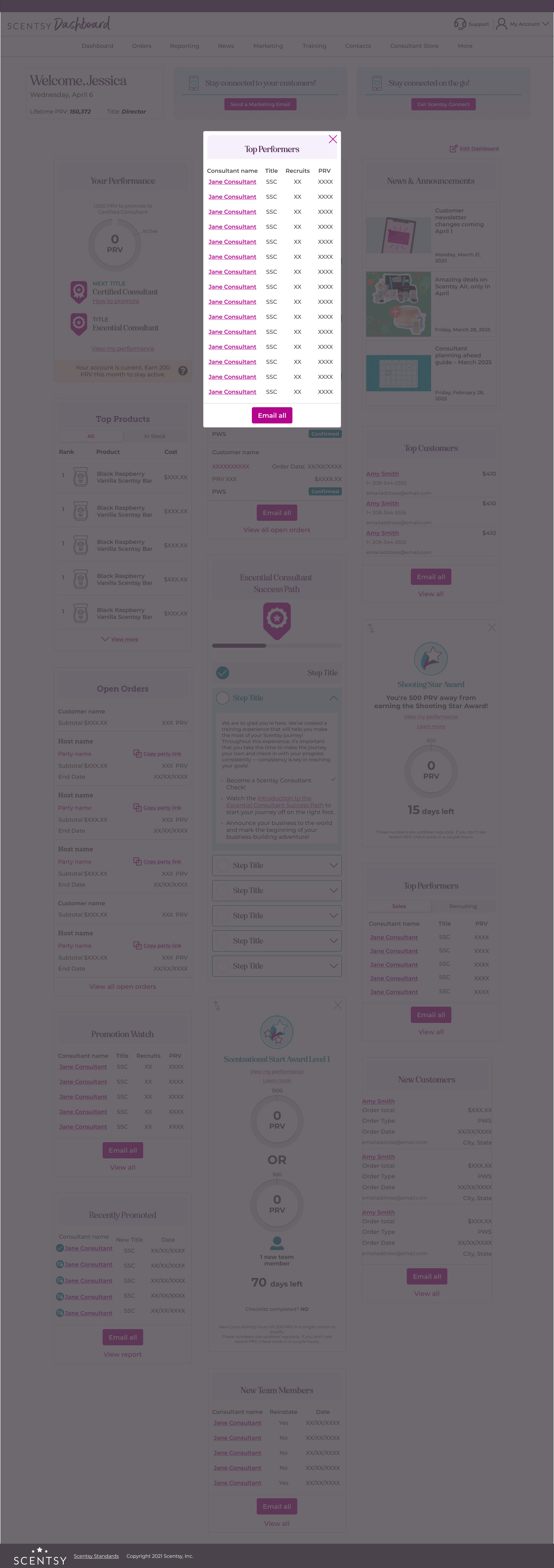
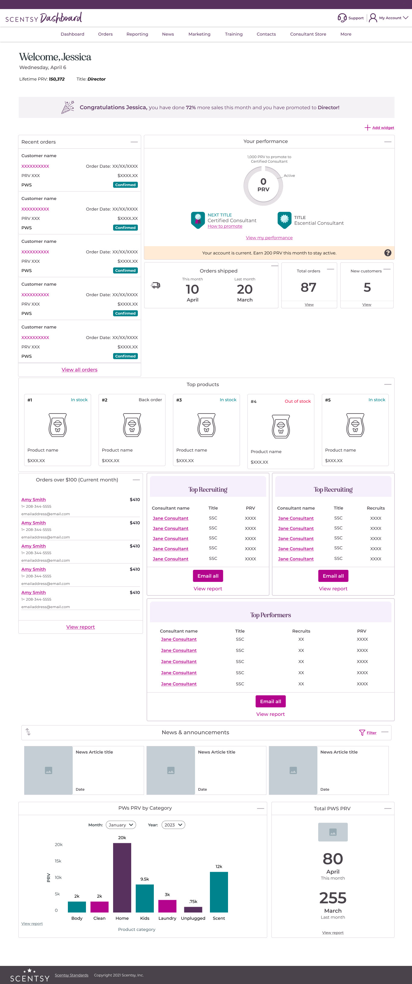
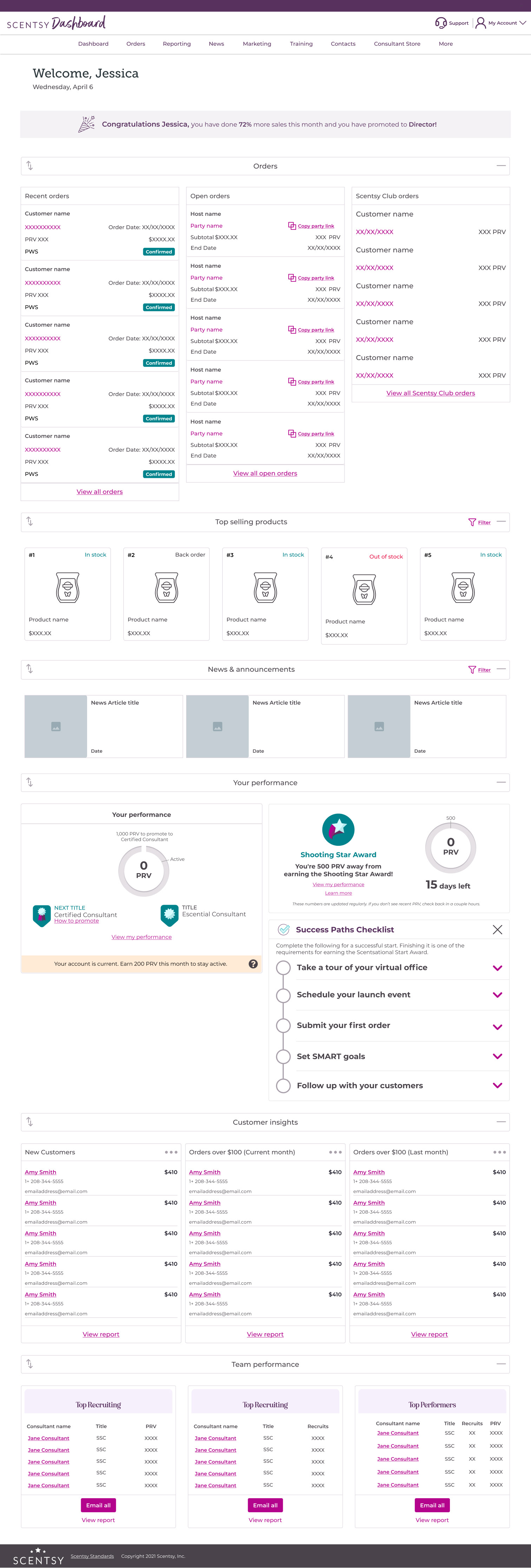
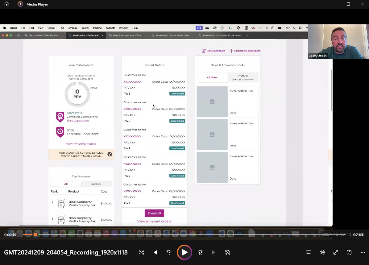
Logging in
Upon login, Consultant immediately have access to a host of information that will help them accomplish whatever task they need, in the moment.
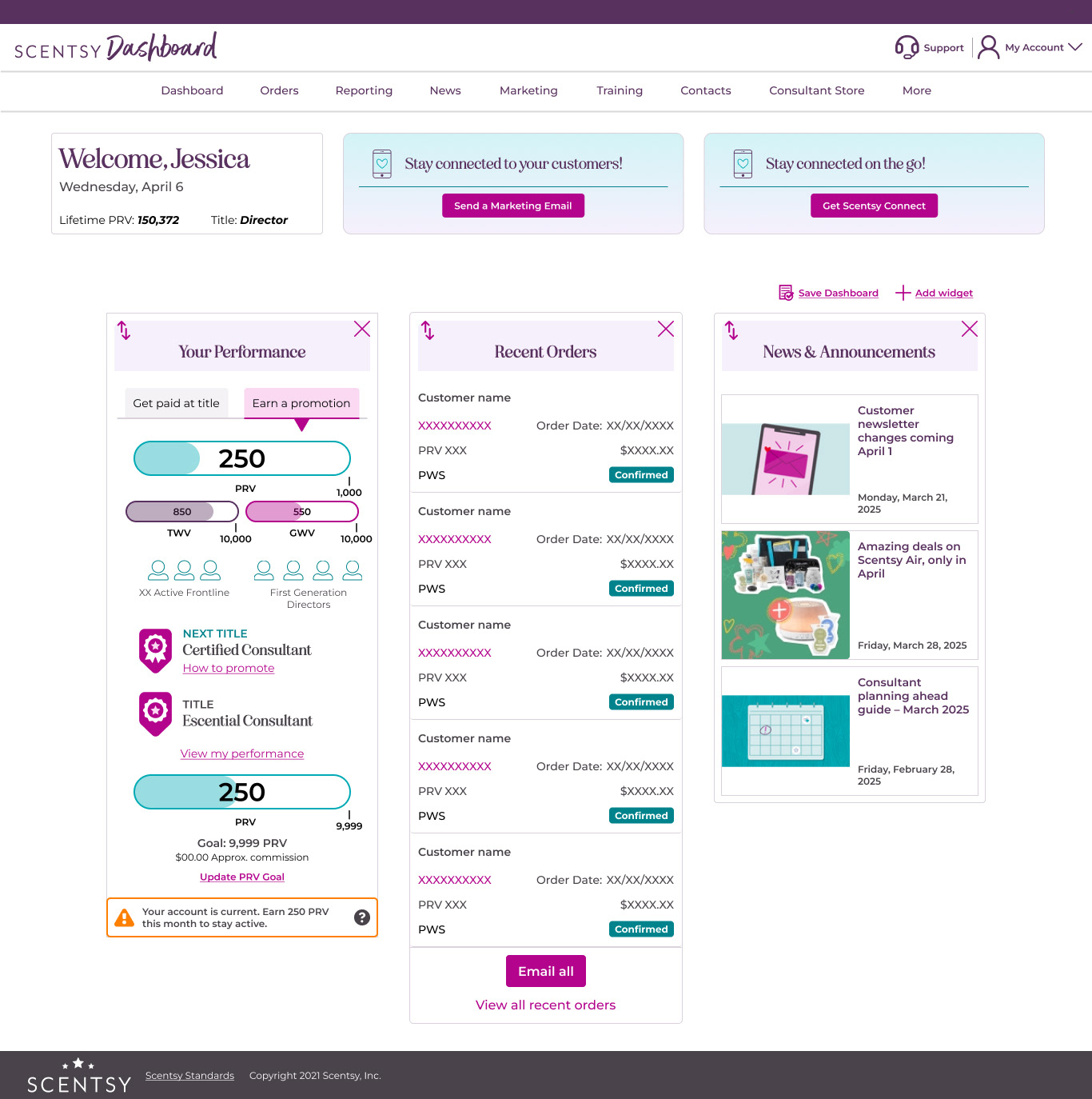
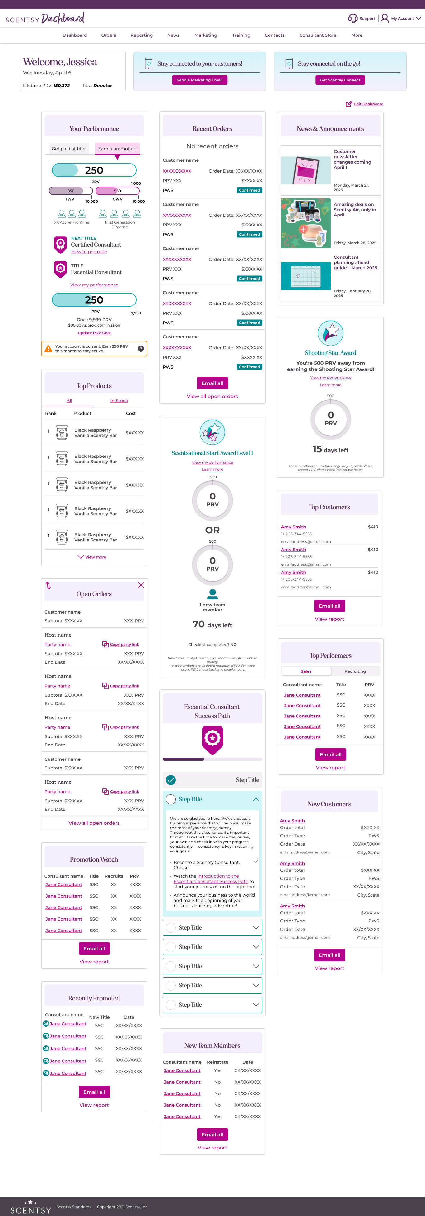
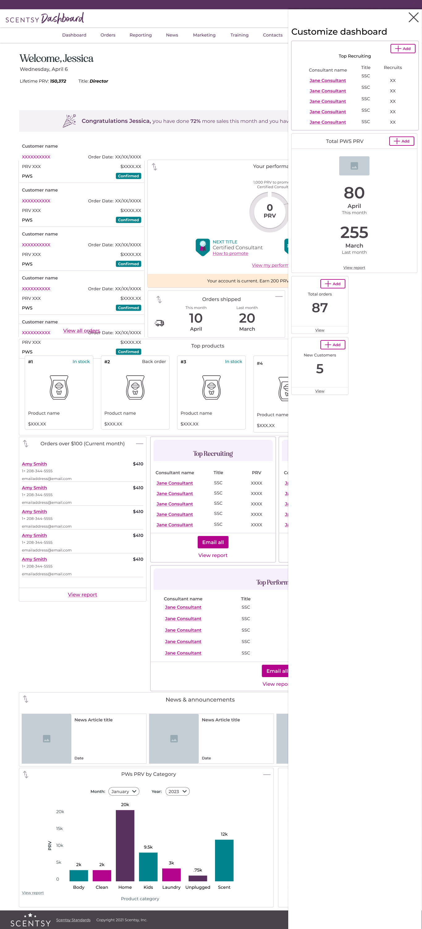
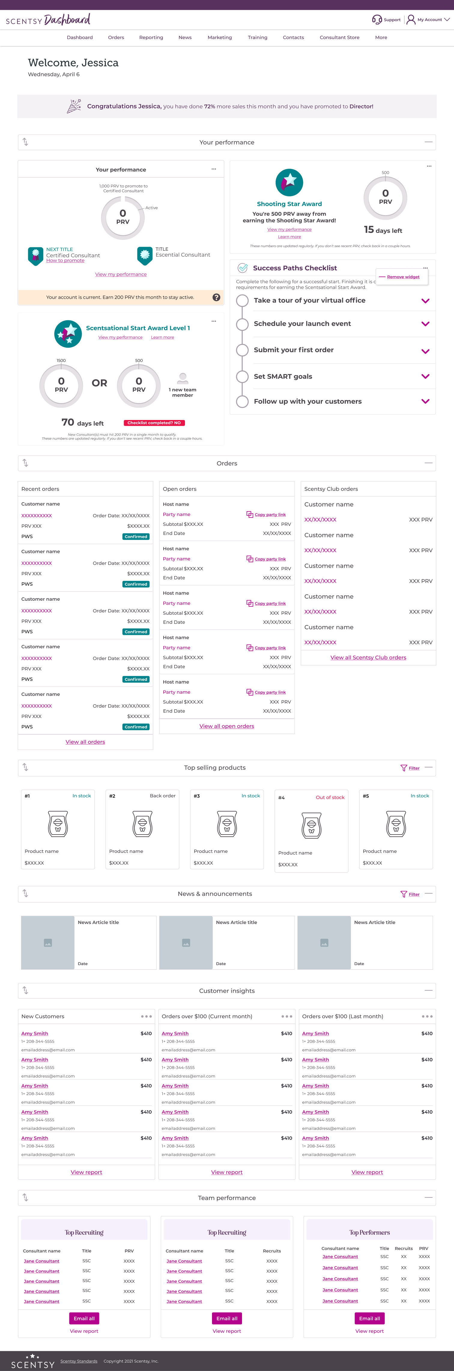
Customization
If the content on the dashboard doesn't suit their needs, they can move and remove any widgets that don't suit their needs. The Consultant can also check the library and customize their dashboard to display the information they need, whether it is sales information, recruiting numbers, or data about their organization.
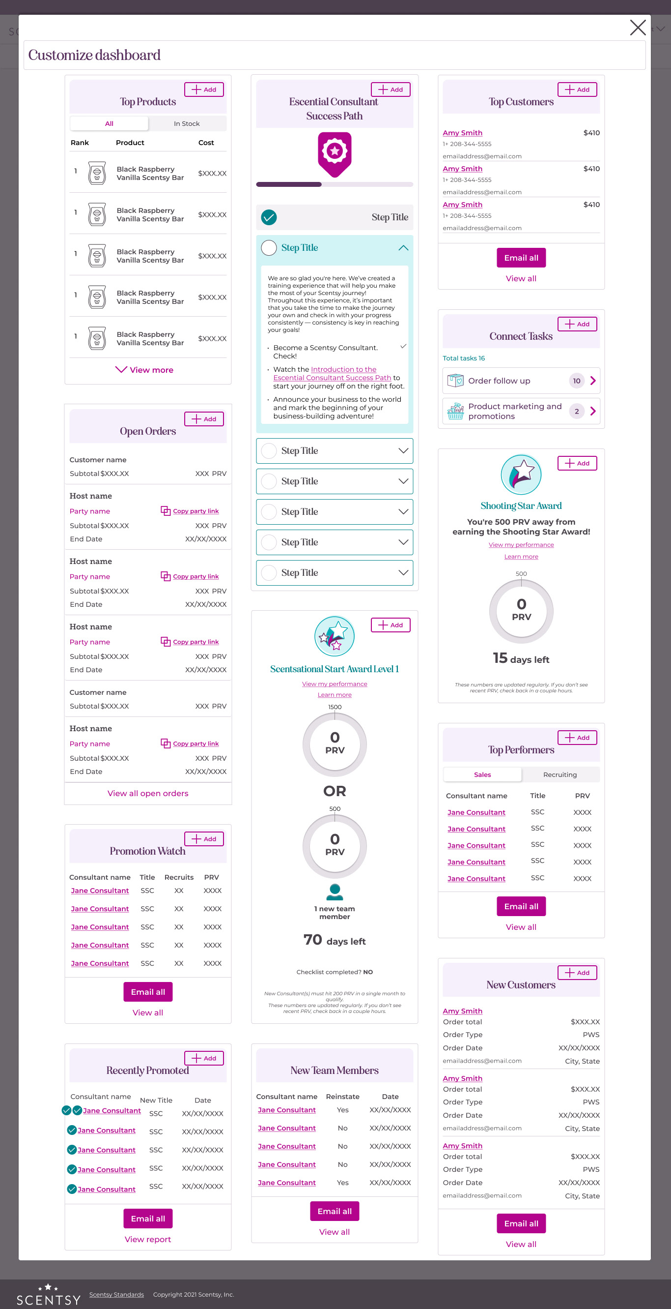
Robust information
A plethora of information is at their finger tips, with enhanced information available for some widgets. They retain the ability to dive further into the information by navigating to their Reporting tab if needed.
Process
Research
To start, I looked at the current Workstation dashboard to see what Consultants currently had available to them. I also sought feedback from Consultants around what they like and dislike about their Workstation Dashboard, what is important and useful to them, and what is missing.
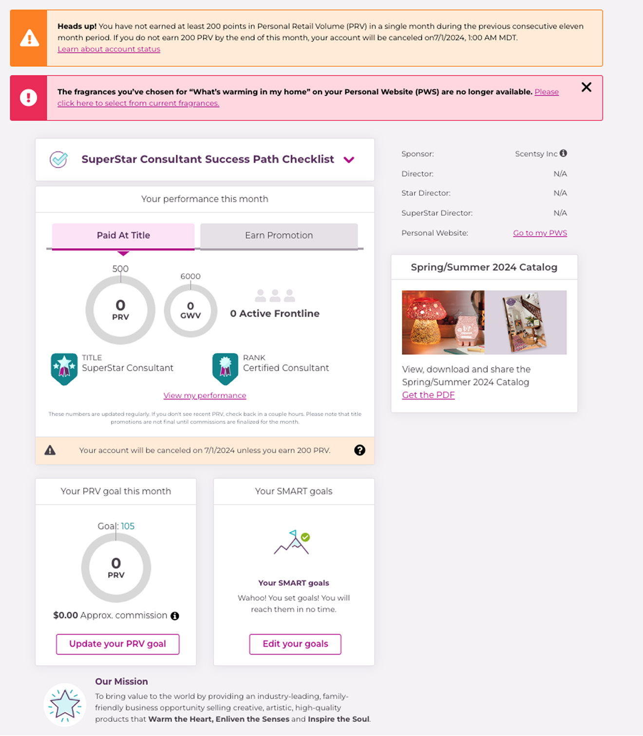
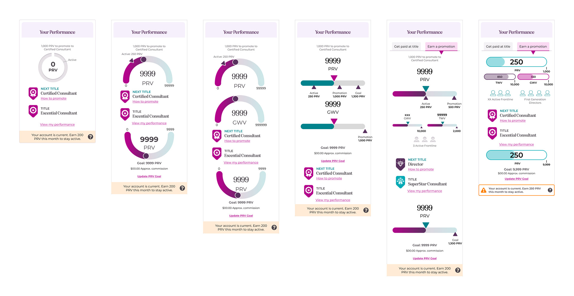
I explored various ways to display data that would be visually appealing while also showing the data clearly. Their current dashboard displays their current title, Personal Retail Volume (PRV), a PRV goal that they may have set for themselves, and a SMART goals widget. The SMART goals widget currently displays no data; the information they input is not supported by the current APIs.
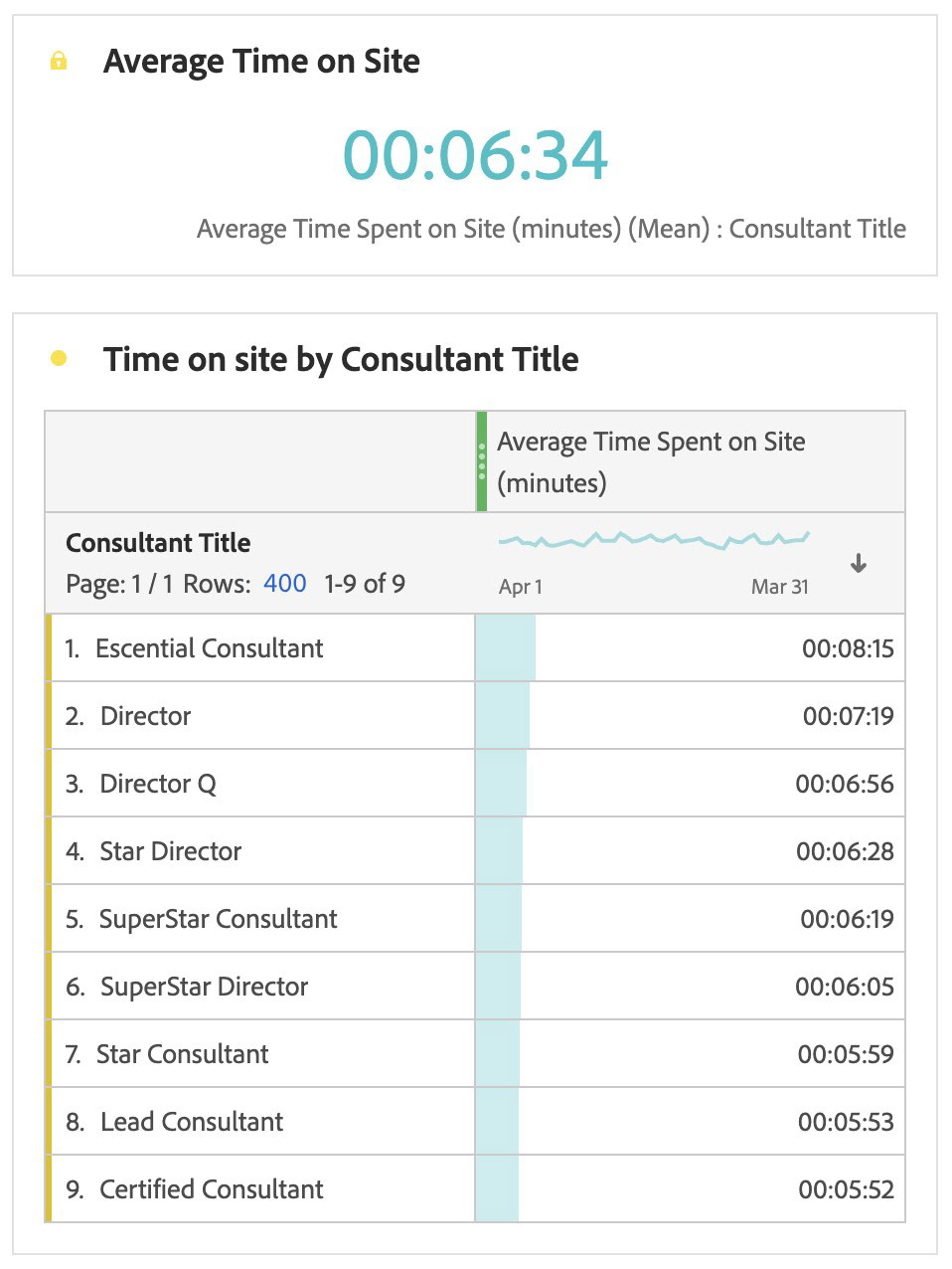
I also looked at the amount of time Consultants were spending on their Workstation. With an average of just 6:34, this supported feedback in initial interviews that Consultants don't have much time to spend on their Workstation. This confirmed the need to quickly show them the information they needed in an easily digestible format.
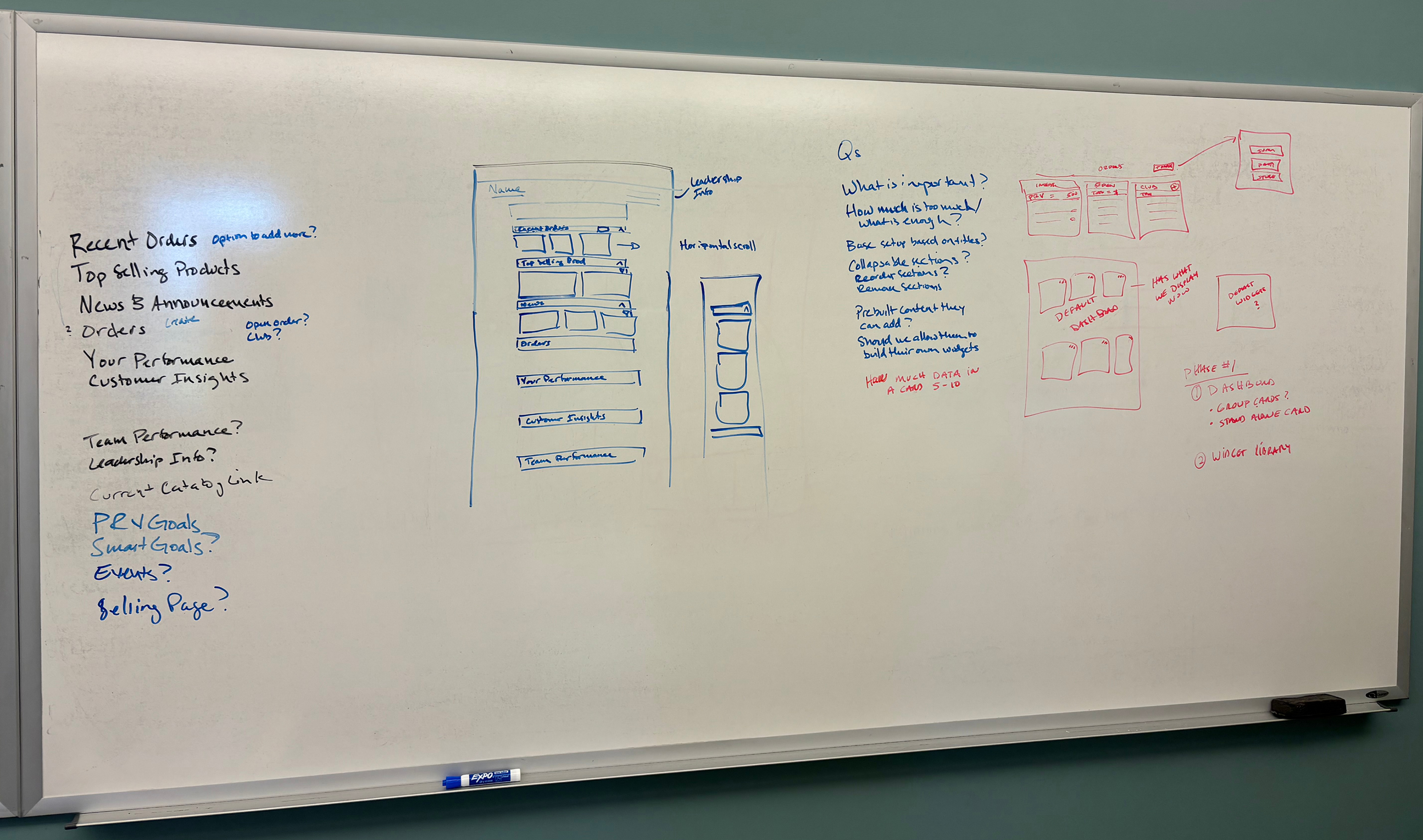
I took time to lay out options on a whiteboard with a colleague to determine the next course of action. I set up various grey box files to chat with the UX team as well as development to determine the best structure for mobile, desktop, and the current infrastructure coding of our system.
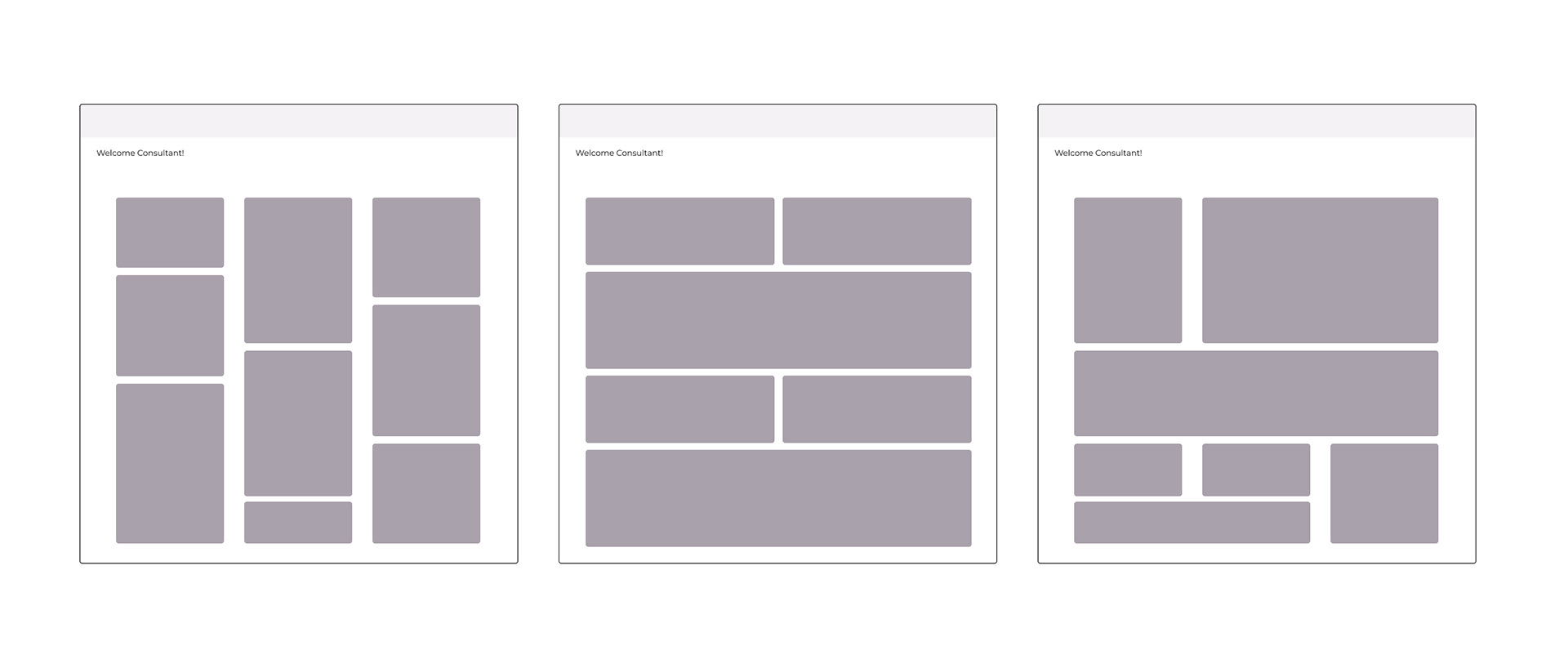
Iterations
After discussions with the internal design team, Technical Program Manager and development, I start utilizing Scentsy's existing design system to create high-fidelity wireframes. The benefit to having a design system for us was to allow fast high-fidelity iterations to get stakeholder feedback quickly as well as a more practical view for users to test.
We discussed both a flexible structure that allowed more free movement of widgets as well as a more rigid structure that only allowed movement between specific categories.
The page as well as the widgets went through iterative processes, seeking feedback from the Technical Program Manager, UX colleagues and users.
User Testing
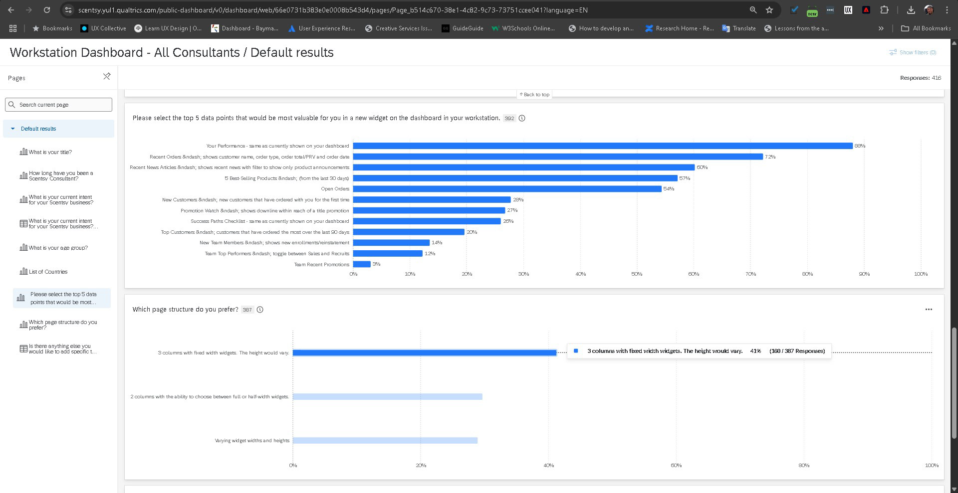
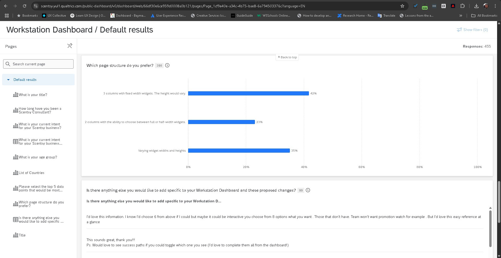
Through user testing by interviews and surveys, it was determined that a flexible structure, allowing Consultants to freely move the widgets as needed, was determined to be the best option. I worked to structure the widgets in such a way, too, that streamlined the development effort across mobile and desktop platforms. Actual videos cannot be shown due to NDA.
I also confirmed feedback I received during these interviews with quantitative feedback through a Qualtrics survey.
Results
This project has not yet completed. The intent was to have it available for beta testing in April. The company intends to track:
• User adoption
• Traffic post-launch
• Average sales
The company also intended to increase the number of widgets to allow greater customization for Consultants. We had also discussed the potential to save dashboard layouts, allowing them to save various layouts based on specific business focuses, whether it be recruiting, late season sales, or incentive pushes.
Final thoughts
This project had been discussed for a long time - years, in fact. To see it nearly come to fruition was exciting and fulfilling. Allowing Consultants to run their businesses with greater efficiency is a top priority for the UX team. While I will not be involved in the final stages, I have no doubt the team will execute.
